
 There’s a newer, easier way to create 2 column forms in Pardot. Click here to learn the best way to create a 2 column Pardot form.
After launching my Form Style Generator for Pardot Forms, the number one question I receive is ‘how do I create a 2 column form in Pardot?’ I might update the style generator to include this in the future, but in the meantime, here’s how to create a 2 column Pardot form with minimal coding.
The basics
When you create a new form in Pardot, there is always a layout template attached to it which determines the styling and the HTML structure of the Pardot form. The out-of-the-box structure for a single form field within Pardot looks like this:
As you can see the field is wrapped within a paragraph tag and there’s a DIV below that to display any error messages.
Step 1: Add a DIV
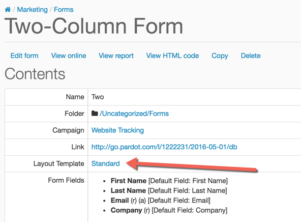
The first step to creating a 2 column pardot form is to add a DIV to your layout template. Navigate to your form by going to Marketing > Forms and click on the layout template link to take you to the template assosicated with the form.
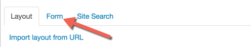
Edit the layout template and navigate to the form tab.
Scroll down in the code until you see %%form-start-loop-fields%% (around line 17) and paste this code directly after %%form-start-loop-fields%%.
Scroll down into the code until you see %%form-end-loop-fields%% (around line 32) and close the DIV on the line before %%form-end-loop-fields%%.
Here’s what my complete code looks like starting at %%form-start-loop-fields%%
%%form-start-loop-fields%%
%%form-if-field-label%%
%%form-end-if-field-label%%
%%form-field-input%%
%%form-if-field-description%%
%%form-field-description%%
%%form-end-if-field-description%%
%%form-field-if-error%%
%%form-field-error-message%%
%%form-field-end-if-error%%
%%form-end-loop-fields%%
The structure for the form HTML now looks like this:
Step 2: Add the CSS
Now, there’s a DIV that hold the form field as well as the error messages for the field, we can add some CSS to create the two columns. The basic CSS looks like this:
Add this to your the bottom layout template to create a two column form. Depending on what your landing page looks like, you might want to add in a width to the columns.
.col {
    float:left;
    width:50%;
}
Questions?
Send them to me via email, send me a tweet @jennamolby, or leave a comment
There’s a newer, easier way to create 2 column forms in Pardot. Click here to learn the best way to create a 2 column Pardot form.
27 Comments
This is great. What would do if you want it to be more responsive? When viewing on a desktop, get 2 columns. But if you’re viewing on a smartphone you would only get 1?
Is the best choice to create 2 identical forms with 2 different layouts? Then on the website hide Form 1 with 2 columns based on the pixel width and show Form 2?
Hi Brian, You wouldn’t need to create 2 forms. You can create 1 form and add some CSS media queries to enable a 1-column form on mobile. Do your landing pages use any sort of web framework (Bootstrap or Foundation)? Using one of these would help a lot since they already have all the CSS already done for you.
Actually, if you plug in bootstrap css you can just assign a class to the field. col-sm-6 for 2 column col-sm-4 for 3 column, etc. No extra styles needed.
That’s a great tip, thanks Katy!
One question: How do you show the field labels within the form field in Pardot? Do you have any examples / example code for this?
Hi Christian, You can add some javascript to your form that will take the labels and turn them into placeholders. Here’s what the script looks like <script>
var labels = document.querySelectorAll(“label”);
var i = labels.length;
while (i–) {
var label = labels.item(i);
var text = label.textContent;
label.parentNode.classList.contains(“required”) && (text += “*”);
label.nextElementSibling.setAttribute(“placeholder”, text);
}
</script> and then you will have to hide the labels using CSS like this: <style>
label {display:none !important;}
</style> Hope that helps!
Many thanks for this! If I wanted 2 fields to be as a 2 column layout but then the other fields to be displayed underneath (one per row) how could I do that?
Hi Sarah, that’s a bit more complicated but totally do-able. Send a link to the Pardot form along with the fields you want as 2-columns to [email protected] and I can help you out.
Hi there, thank you for this article, helps a lot. I was wondering if you could tell me what to change for a 3 and/or 4 column form if you don’t mind. Thank you!
Hello! For a 3-column form the CSS would look like this .col:nth-child(3n+1){
clear:left;
} for a 4-column form the CSS would look like this .col:nth-child(4n+1){
clear:left;
}