
In this tutorial, I’ll show you the best way to create a two-column Pardot form. This is a follow up on my original post How to Create a 2 Column Pardot Form. By popular request, this new method includes a way to make certain form fields full width and is fully responsive. All you have to do is add CSS classes to your form fields and copy & paste the CSS provided into Pardot.
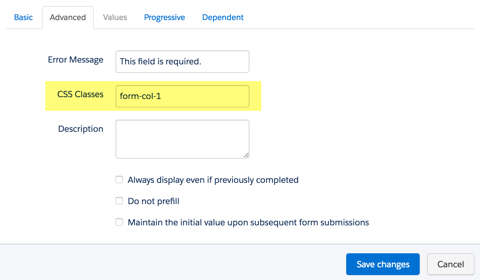
Add CSS classes to your form fields
The first step is to add CSS classes to your form fields. We will be using three different classes within the forms:
- form-col-1: Add this to form fields that will be in the left column.
- form-col-2: Add this to form fields that will be in the right column.
- form-col-full: Add this to form fields that you want in a single, full-width column.
To add a class to a form field, navigate to the fields tab of your form, click on the pencil icon to edit the form field. Then, click on the advanced tab and enter the class name in the CSS classes field.
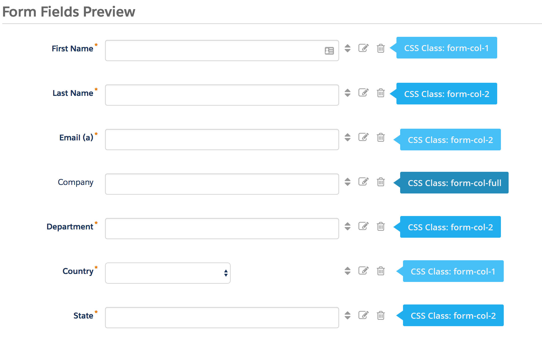
Repeat this process until all form fields have one of the three classes. Here’s an outline of what my sample form looks like, where all the fields are in two columns except for the email field which is full width.
Edit the Form HTML
By default, every form field within your form will be wrapped in paragraph tags (<p></p>). This is not ideal when it comes to creating two-column forms, but it’s easy to update.
Navigate to your layout template and click on the Form tab. Change the paragraph tag to a DIV and close it right after the error message fields, as illustrated below.

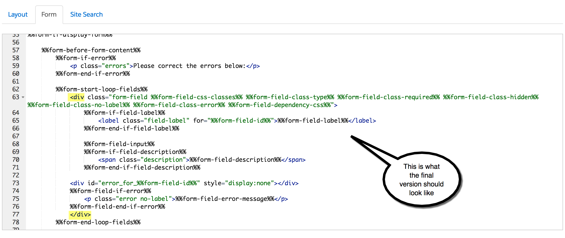
Alternatively, replace the ENTIRE content within the form tab with the code below.
Add the CSS
Next, you need to add the following CSS in Pardot. You can add this in the layout template or within the form editor under look and feel > above form.
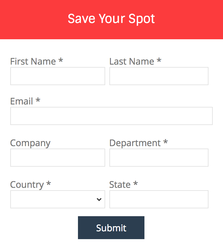
Here’s what my example form looks like with all the CSS added.
Questions?
Send me a tweet @jennamolby, leave a comment below, or book a Peer Chat.
93 Comments
Hi Jenna, this worked great, but my reCaptcha button is covering up my submit button making it impossible to click submit. Any idea on a fix to move the recaptcha button away from the submit button? Preferably Submit button left column, Recaptcha right column.
Hi Teddy, Adding this CSS should do the trick
#pardot-form .g-recaptcha {
clear:both !important;
}
This is great, any way to make it switch to single column when on a mobile phone?
Hi Jonathan, Thank you! Adding this CSS will switch it to a single column on mobile.
@media only screen and (max-width : 768px) {
body #pardot-form div.form-col-1,
body #pardot-form div.form-col-2 {
width:100% !important;
}
}
Hi Jenna,
Thank you so much for the wonderful article, I’ve tried to implement this solution and succeeded partially, there two issues I want to solve.
1. to Add Placeholder Text Within Pardot Forms and hide the labels (I tried this first by referring to your article:https://jennamolby.com/how-to-add-placeholder-text-within-pardot-forms/comment-page-4/#comments) but as soon as I applied the above code it’s not working now.
2. I have 3 fields, first name, last name & email. first name and last name I’ve applied class form-col-1 and form-col-2 and for email form-col-full, but I want the submit button to appear next to email field. how could I achieve this?
Please help me out in this!!
Hi Abhishek, You’re welcome! If you are using this method in conjunction with the placeholder script, you need to modify the placeholder script a bit. Here’s the updated script
<script>
var labels = document.querySelectorAll("div.pd-text label, div.pd-select label, div.pd-textarea label");
var i = labels.length;
while (i–) {
var label = labels.item(i);
var text = label.textContent;
label.parentNode.classList.contains("required") && (text += " *");
var nextElement = label.nextElementSibling;
if (nextElement) {
if (nextElement.tagName == 'SELECT') {
nextElement.options[0].text = text;
} else {
nextElement.setAttribute("placeholder", text);
}
label.parentNode.removeChild(label);
}
}
</script>
Hi Jenna, thank you for this. I was wondering is there a way for this to display correctly when the fields on column 2 don’t display when previously completed? I’m having a problem because the full-width field appears in column 2.
Thank you
Hi Marina, You’re welcome! I haven’t come across this in my testing. If you’re still having issues email me the link to the form and I can take a look.
Your solution worked well except the fields on the right column run off the div container space and end up looking like they’re cut off. Changing the size of the field, padding or margin doesn’t seem to matter..
Hi Jay, Have you tried modifying the width of the columns?
body form.form div.form-col-1 {
width: 49% !important;
}
body form.form div.form-col-2 {
width: 49% !important;
}
That might do the trick.