
In this tutorial, I’ll show you the best way to create a two-column Pardot form. This is a follow up on my original post How to Create a 2 Column Pardot Form. By popular request, this new method includes a way to make certain form fields full width and is fully responsive. All you have to do is add CSS classes to your form fields and copy & paste the CSS provided into Pardot.
Add CSS classes to your form fields
The first step is to add CSS classes to your form fields. We will be using three different classes within the forms:
- form-col-1: Add this to form fields that will be in the left column.
- form-col-2: Add this to form fields that will be in the right column.
- form-col-full: Add this to form fields that you want in a single, full-width column.
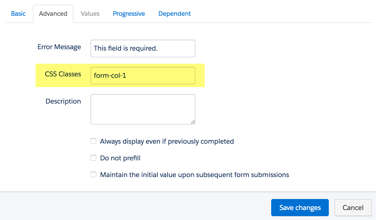
To add a class to a form field, navigate to the fields tab of your form, click on the pencil icon to edit the form field. Then, click on the advanced tab and enter the class name in the CSS classes field.
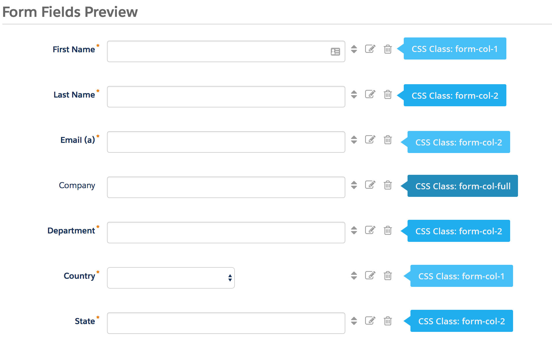
Repeat this process until all form fields have one of the three classes. Here’s an outline of what my sample form looks like, where all the fields are in two columns except for the email field which is full width.
Edit the Form HTML
By default, every form field within your form will be wrapped in paragraph tags (<p></p>). This is not ideal when it comes to creating two-column forms, but it’s easy to update.
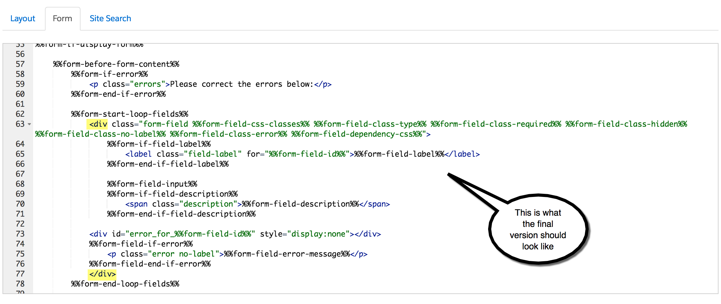
Navigate to your layout template and click on the Form tab. Change the paragraph tag to a DIV and close it right after the error message fields, as illustrated below.

Alternatively, replace the ENTIRE content within the form tab with the code below.
Add the CSS
Next, you need to add the following CSS in Pardot. You can add this in the layout template or within the form editor under look and feel > above form.
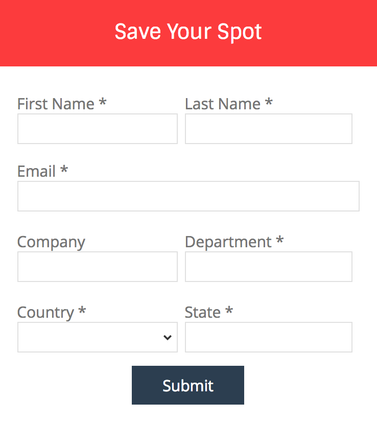
Here’s what my example form looks like with all the CSS added.
Questions?
Send me a tweet @jennamolby, leave a comment below, or book a Peer Chat.
93 Comments
Hi Jenna, thanks for this amazing instruction. However, my colums aren’t in a row. The right column is always lower than the left one. Do you know how I can fix this? Thanks a lot.
Hi Theresa, you might have some additional CSS on the page that might be causing this. Email me the link and I can take a look.
My forms are displaying columns, but the columns take up the full width of my screen (in this case a 24 inch monitor), specifically the input parts for users to fill in. It doesn’t look like your example with 2 columns of reasonable size. Am I missing something?
Hi Mike, the CSS for this example allows for the form to be responsive. Once you place the form on your landing page the form will adjust to the size of the content area. If you do not want it to be responsive, update the widths within the CSS to pixels (px) instead of percentages (%).
Hi Jenna,
I have tried to do this but have found the 2nd column is not aligned at the top of the page and that the first field in column 2 starts level with the last field in column 1. Do you know what causes that?
Hi Liam, you might have some custom CSS on your form that is causing the issue. Email the link to your form and I can take a look for you.
Hi Jenna !
Really helpful article (again 😉
One question – dropboxes are displayed a bit shorter (less wide) than the other fields.
Do you have any idea how to fix this ?
Thanks
Tom
Hi Thomas, So happy you found this article helpful :). You might need to add a width to your to your dropdowns using CSS like this: form.form select {width:200px !important;} or this form.form select {width:100% !important;}. Hope that helps! Cheers, Jenna
Hi!!!
By creating the two columns, it does not set them up next to each other, it sets them up underneath each other… Why?
Thank you
Hi Siria, It’s difficult to troubleshoot your issue without seeing the form. It could be that you have some conflicting CSS on the page that is causing the issue. Email me the link to your form and I can take a look.