
In this tutorial, I’ll show you the best way to create a two-column Pardot form. This is a follow up on my original post How to Create a 2 Column Pardot Form. By popular request, this new method includes a way to make certain form fields full width and is fully responsive. All you have to do is add CSS classes to your form fields and copy & paste the CSS provided into Pardot.
Add CSS classes to your form fields
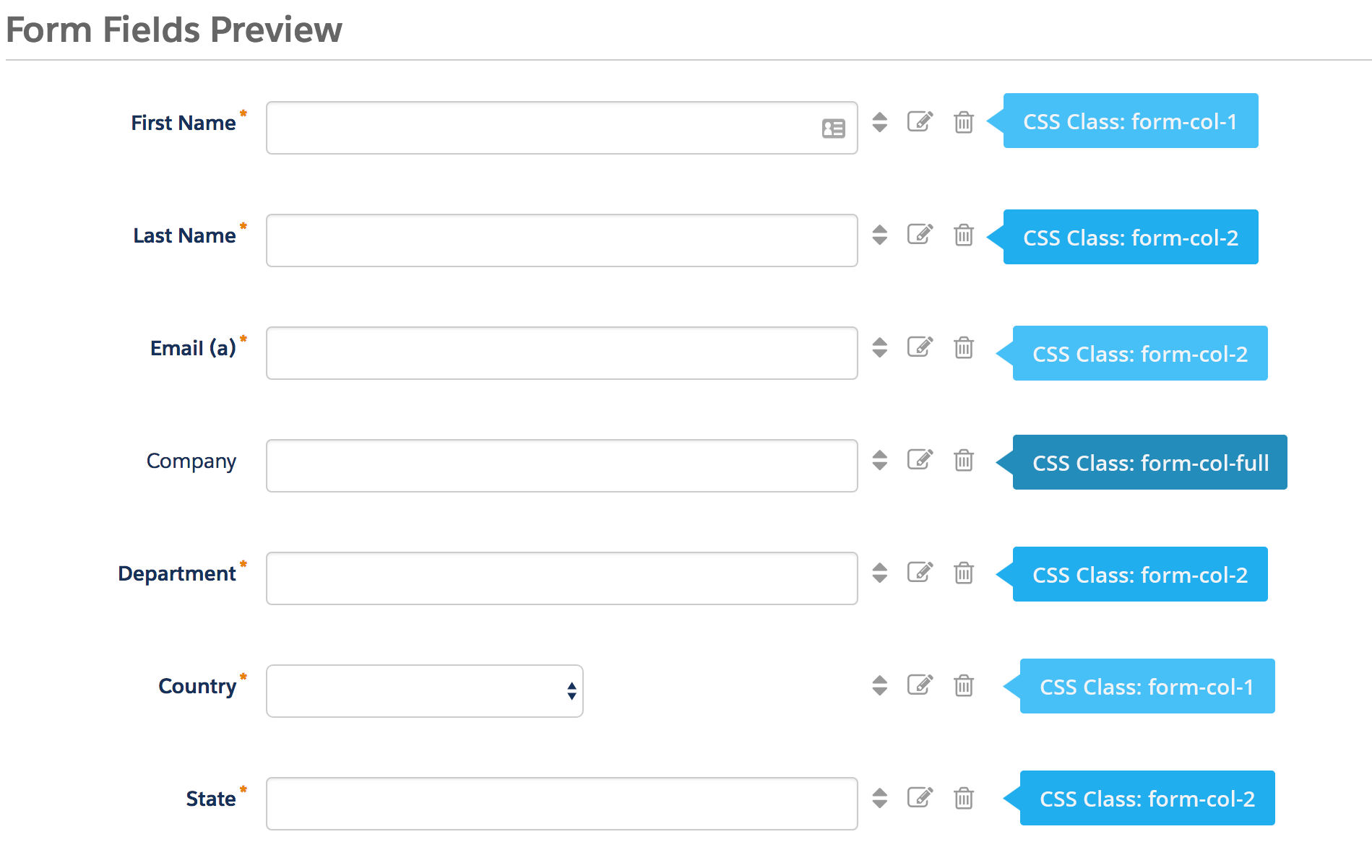
The first step is to add CSS classes to your form fields. We will be using three different classes within the forms:
- form-col-1: Add this to form fields that will be in the left column.
- form-col-2: Add this to form fields that will be in the right column.
- form-col-full: Add this to form fields that you want in a single, full-width column.
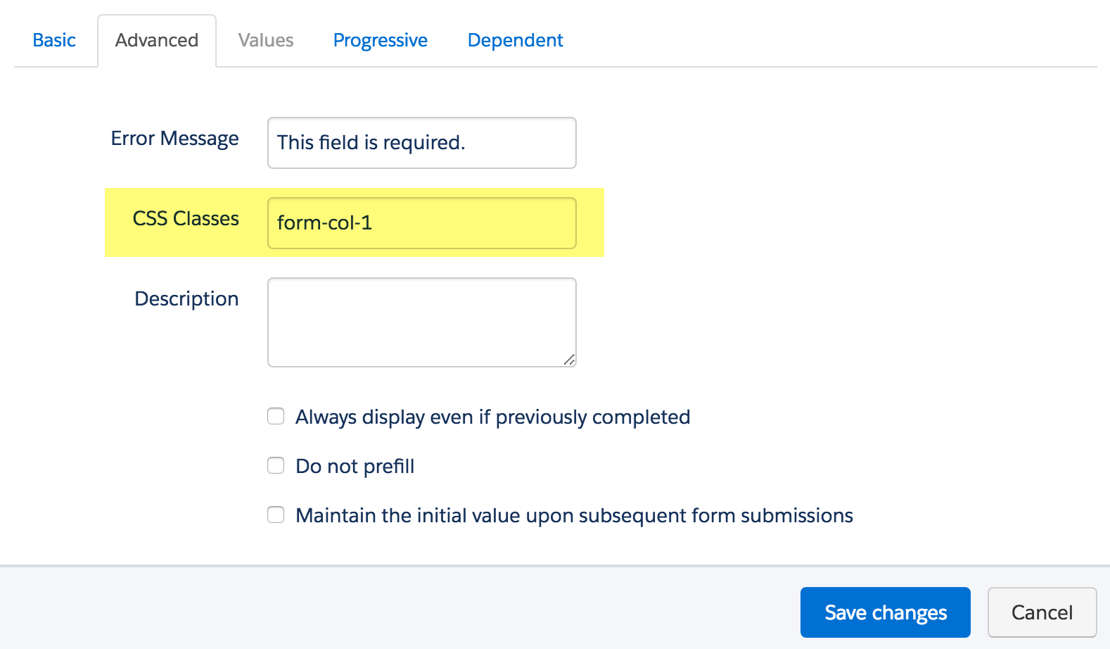
To add a class to a form field, navigate to the fields tab of your form, click on the pencil icon to edit the form field. Then, click on the advanced tab and enter the class name in the CSS classes field.
Repeat this process until all form fields have one of the three classes. Here’s an outline of what my sample form looks like, where all the fields are in two columns except for the email field which is full width.
Edit the Form HTML
By default, every form field within your form will be wrapped in paragraph tags (<p></p>). This is not ideal when it comes to creating two-column forms, but it’s easy to update.
Navigate to your layout template and click on the Form tab. Change the paragraph tag to a DIV and close it right after the error message fields, as illustrated below.

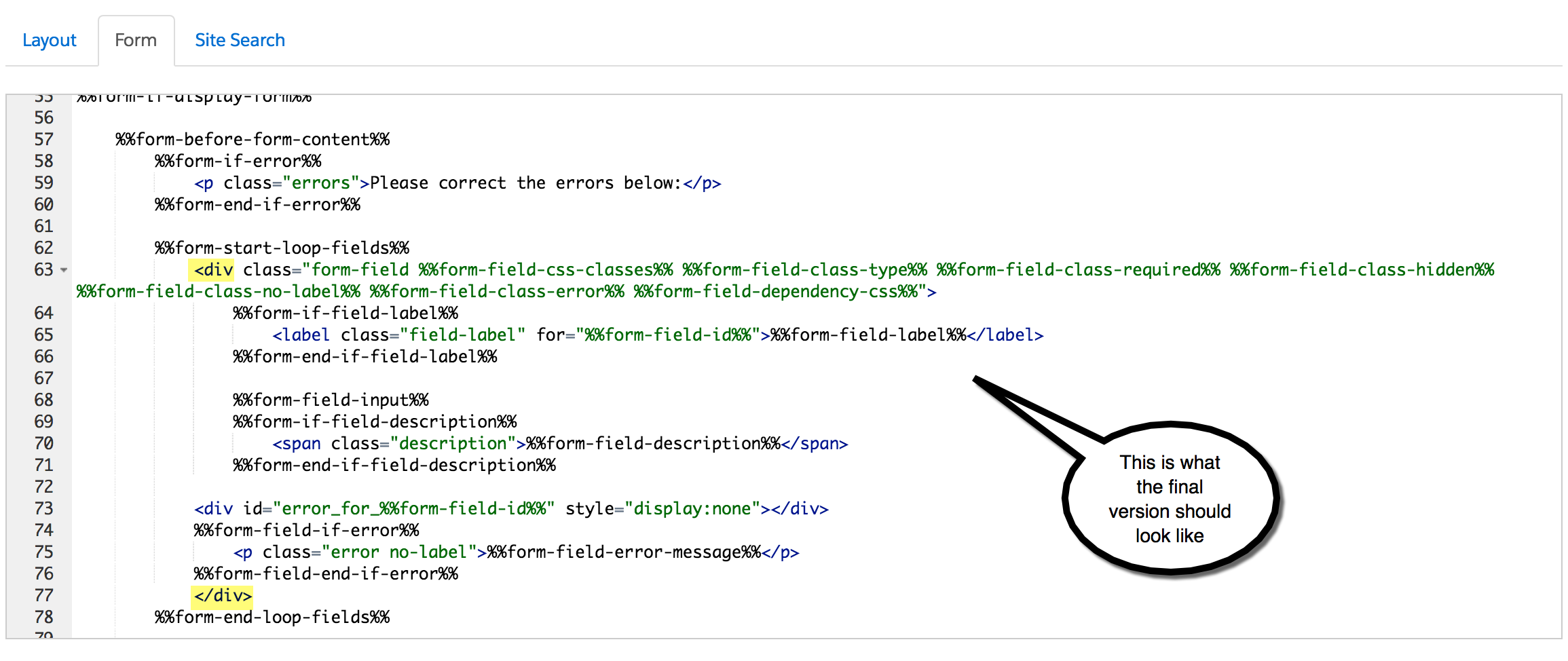
Alternatively, replace the ENTIRE content within the form tab with the code below.
Add the CSS
Next, you need to add the following CSS in Pardot. You can add this in the layout template or within the form editor under look and feel > above form.
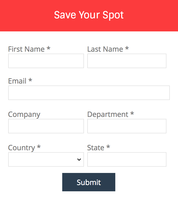
Here’s what my example form looks like with all the CSS added.
Questions?
Send me a tweet @jennamolby, leave a comment below, or book a Peer Chat.
93 Comments
To make the form stack on am mobile device you will need to add the viewport meta tag in the html head:
Without it the device assumes and sets the viewport to full size.
Excellent tutorial, one small question how to show the error messages exactly under the text boxes???
Hi Jenna,
This is extremely helpful as our marketing team is looking to enhance our website. Quick question regarding the CSS code. Where would you typically find this if you were adding this to the Layout Template?
Thanks in advance!
Hi Brandon, So happy you found it helpful! You would add it between the HEAD tags of your layout template. Cheers, Jenna
I found that I needed to add “clear:both !important” to the “form-col-full” class to prevent full width elements to overstep the other rows.
This was a great article and very helpful! Thank you for posting. I have a quick question though. I have attempted copying the code from your examples, but unless I have a form-col-full field on the very bottom of my form, or exclude the CSS style on at least one of my fields, the form-col-1 fields won’t allow me to select them to fill in my information unless I select on the far right side. I worry someone interested in filling it in may think the form is broken and change their mind. Is there something that I’m missing? I appreciate any insight you can provide.
Hi Katie, Sorry you are experiencing issues when implementing this. Please send me an email at [email protected] with a link to your form and I can take a look. Cheers, Jenna