Looking for a way to spice up your Pardot email preferences page? Try using toggles instead of checkboxes. In this tutorial, I’ll show you how to create a preferences page that uses toggles instead of checkboxes. With a bit of HTML and some CSS, you can transform your preferences page in four easy steps.
Demo: Creating toggles for Pardot Email Preference Center
Here’s an example of what we’ll be creating in this tutorial.

Step 1: Style your preference page
This post does not cover the basics of styling your Pardot preferences page. Click here to learn how to customize your page from scratch.
Step 2: Update the preferences page template
To make the toggles work, you will need to edit the form section of your layout template. Navigate to the layout template and click on the form tab. Replace the content with this HTML.
<!DOCTYPE html>
<html>
<head>
<base href="http://go.pardot.com">
<meta charset="utf-8">
<meta content="text/html; charset=utf-8" http-equiv="Content-Type">
<meta content="%%description%%" name="description">
<title>Preferences Page</title>
<link crossorigin="anonymous" href="https://stackpath.bootstrapcdn.com/bootstrap/4.1.1/css/bootstrap.min.css" integrity="sha384-WskhaSGFgHYWDcbwN70/dfYBj47jz9qbsMId/iRN3ewGhXQFZCSftd1LZCfmhktB" rel="stylesheet">
<meta content="noindex, nofollow" name="robots">
<link href="https://go.pardot.com/css/form.css?ver=2020-10-19" rel="stylesheet" type="text/css">
</head>
<body>
<div>
<div>
<div>
<img alt="" src="https://via.placeholder.com/220x65.png?text=LOGO" width="250">
<div>
<div>
<form accept-charset="UTF-8" action="xx" id="pardot-form" method="post" name="pardot-form">
<p>Select which lists you would like to receive email communications from.</p>
<ol>
<li>
<label for="piEmailPrefEmail">Email Address</label> <input id="piEmailPrefEmail" name="piEmailPrefEmail" readonly="readonly" type="text" value="j******1@g*******l.com">
<div id="error_for_piEmailPrefEmail" style="display:none">
</div>
</li>
<li>
<input id="piEmToken" name="piEmToken" readonly="readonly" type="hidden" value=""">
<div id="error_for_piEmToken" style="display:none">
</div>
</li>
<li>
<input id="list_111694" name="list[]" type="checkbox" value="111694" checked="checked"> <label for="list_111694">Conferences & Events</label> <span>The latest updates on our events including webinars and our annual conference.</span>
<div id="error_for_list_111694" style="display:none">
</div>
</li>
<li>
<input id="list_111688" name="list[]" type="checkbox" value="111688"> <label for="list_111688">News & Updates</label> <span>Get the best content right in your inbox.</span>
<div id="error_for_list_111688" style="display:none">
</div>
</li>
<li>
<input id="list_111692" name="list[]" type="checkbox" value="111692"> <label for="list_111692">Product Updates</label> <span>Occasional emails about product releases and updates.</span>
<div id="error_for_list_111692" style="display:none">
</div>
</li>
<li>
<input id="list_111690" name="list[]" type="checkbox" value="111690" checked="checked"> <label for="list_111690">Weekly Blog Digest</label> <span>Our latest blog posts delivered weekly to your inbox.</span>
<div id="error_for_list_111690" style="display:none">
</div>
</li>
<li>
<a data-confirm="Are you sure you want to opt out from all future email communications?" href="">Opt out from all email communications</a>
<div id="error_for_gUnsub" style="display:none">
</div>
</li>
</ol>
<p style="position:absolute; width:190px; left:-9999px; top: -9999px;visibility:hidden;"><label for="pi_extra_field">Comments</label> <input id="pi_extra_field" name="pi_extra_field" type="text"></p>
<!-- forces IE5-8 to correctly submit UTF8 content -->
<input name="_utf8" type="hidden" value="☃">
<p><input accesskey="s" type="submit" value="Save Preferences">
</p>
<script type="text/javascript">
//<![CDATA[
var anchors = document.getElementsByTagName("a");
for (var i=0; i<anchors.length; i++) {
var anchor = anchors[i];
if(anchor.getAttribute("href")&&!anchor.getAttribute("target")) {
anchor.target = "_top";
}
}
//]]>
</script>
</form>
</div>
</div>
</div>
</div>
</div>
<script src="https://code.jquery.com/jquery-latest.min.js"></script>
<script type="text/javascript">
$( document ).ready(function() {
$('label').contents().each(function() {
if (this.nodeType == 3 && $.trim(this.nodeValue) != '') {
$(this).wrap('<span></span>');
}
});
$('.label-wrapper').after('<span></span>');
});
</script>
</body>
</html>What’s changed?
- Instead of placing the form fields in a paragraph, the form fields are placed in an ordered list with a class named “switches”.
- Some jQuery is added to update the HTML markup of the preferences form.
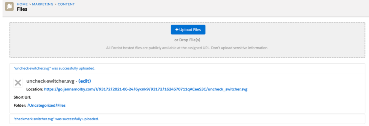
Step 3: Upload icons into Pardot
There are two icons that will need to be uploaded in Pardot, a checkmark icon and a “x” icon. Download the images and then upload the images into the content library within Pardot.
Step 4: Add the CSS for the toggles
Add this CSS to your layout template. Update the first couple of lines to include the image paths to the icons you uploaded in step 4.
/* Update this line with the URL of your checkbox image */
.switches .pd-checkbox [type="checkbox"]:checked + label span:last-child::after {
background-image: url(https://);
}
/* Update this line with the URL of your "X" image */
.switches .pd-checkbox span:last-child::after {
background: url(https://);
}
* {
padding: 0;
margin: 0;
box-sizing: border-box;
}
ol {
list-style: none;
}
label {
cursor: pointer;
}
#pardot-form p {
margin-left:0;
padding-left:0;
}
/* hide the checkbox */
[type="checkbox"] {
position: absolute;
left: -9999px;
}
/* Position the checkbox label */
.switches .pd-checkbox label {
display: flex;
align-items: center;
justify-content: space-between;
}
/* Style the switch */
.switches .pd-checkbox label.inline span:last-child {
position: relative;
width: 50px;
height: 26px;
border-radius: 15px;
box-shadow: inset 0 0 5px rgba(0, 0, 0, 0.4);
background: #434257;
transition: all 0.3s;
}
.switches .pd-checkbox label.inline span:last-child::before,
.switches .pd-checkbox label.inline span:last-child::after {
content: "";
position: absolute;
}
.switches .pd-checkbox span:last-child::before {
left: 1px;
top: 1px;
width: 24px;
height: 24px;
background: #FFF;
border-radius: 50%;
z-index: 1;
transition: transform 0.3s;
}
/* Style the "X" switch */
.switches .pd-checkbox span:last-child::after {
top: 50%;
right: 8px;
width: 12px;
height: 12px;
transform: translateY(-50%);
background-size: 12px 12px;
}
/* Style the "ON" switch */
.switches .pd-checkbox [type="checkbox"]:checked + label span:last-child {
background: #00d084;
}
.switches .pd-checkbox [type="checkbox"]:checked + label span:last-child::before {
transform: translateX(24px);
}
.switches .pd-checkbox [type="checkbox"]:checked + label span:last-child::after {
width: 14px;
height: 14px;
left: 8px;
background-size: 14px 14px;
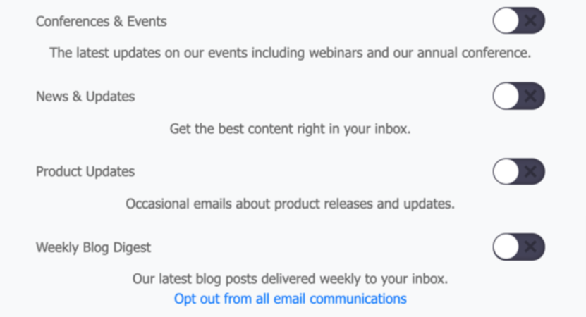
}Now your page would look something like this, with the checkboxes turned into toggles.
Optional: Add any additional CSS
I added some additional CSS to my page to style the labels, list descriptions and options for my page. Here’s the CSS I added.
#pardot-form .no-label{
  text-align:center;
   margin-top:35px;
}
#pardot-form .no-label a {
 text-decoration:underline;
}
#pardot-form label {
  font-weight:500;
  font-size:15px;
}
.pd-email {
  margin:20px 0;
}
#pardot-form .description {
  text-align:left;
  display:block;
}
#pardot-form li.pd-checkbox {
  background-color:#FFF;
  margin-bottom:5px;
  border:solid 1px #ebebeb;
  padding:0px 20px 20px 20px;
  border-radius:5px;
  -moz-border-radius:5px;
  -webkit-border-radius:5px;
}
#pardot-form .label-wrapper {
  color:#444444;
}
#pardot-form {
  color:#737373;
}
#pardot-form .form-field {
  text-align:left;
}
#pardot-form input.text {
   border:solid 1px #ebebeb;
  padding:10px;
  border-radius:5px;
  -moz-border-radius:5px;
  -webkit-border-radius:5px;
  color:#737373;
}
#pardot-form .no-label {
  text-align:center;
}
#pardot-form .no-label a {
    color:#737373;
}
The final result
Here’s what my final page looks like.
Questions?
Send me a tweet @jennamolby, or contact the Sercante team for help.