
Creating a Salesforce marketing dashboard is an effective way to see how you are doing against your marketing targets. What channels are most effective for generating pipeline? How many leads did we generate this month compared to last month? In this post, I’ll share some example marketing dashboard components and some tips and tricks for creating dashboards in Salesforce.
Hot Tip: Check out this blog post to learn more about choosing a Salesforce marketing reporting tool.
Salesforce Marketing Dashboard Tips & tricks
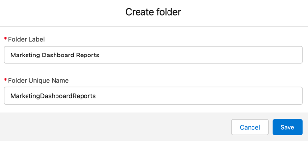
Create a reports folder for your dashboard reports
Anyone accessing your dashboard also needs access to the underlying reports. Creating a separate folder for your reports allows you to easily control who has access to them. And (bonus!) it’s easier to find your reports when you are creating your dashboard.
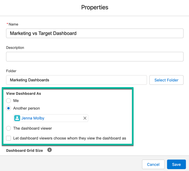
Choose your dashboard running user wisely
Each dashboard has a running user, whose security settings determine which data to display in a dashboard. If the running user is a specific user, all dashboard viewers see data based on the security settings of that user—regardless of their own personal security settings. For this reason, you’ll want to choose the running user wisely, so as not to open up too much visibility.
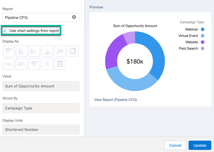
Add a chart directly to your report
Adding a chart directly within your report can speed up your dashboard setup time, especially if you are going to use the same report on multiple dashboards. It is also helpful if you are going to share the report directly instead of the dashboard.
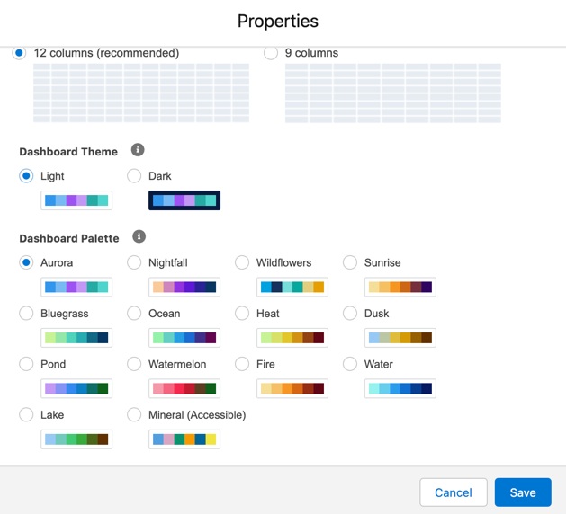
Change your dashboard palette
Give your dashboard a fresh new look by changing the dashboard palette. There are 14 themes available in both light and dark mode.
Resuse reports within your dashboard
The same report can be used many times within your dashboard. This is a great way to visualize the same data in different ways without creating multiple reports.
Example Dashboard Components
Let’s dive into some examples of what type of reports you might want to add to your dashboard. In these examples, I’m specifically looking at the pipeline and revenue marketing has generated. To pull these reports, I have the primary campaign source field populated on the opportunity and I use the campaigns with influenced opportunties report type. Your setup might be differ depending on how you associate marketing campaigns with opportunities.
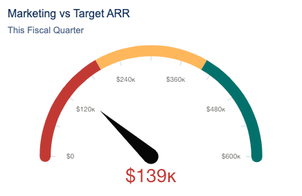
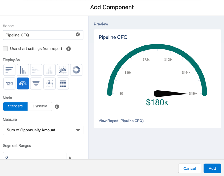
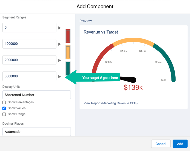
Marketing vs Target
What this reports answers: How are we tracking against our pipeline target?
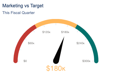
Report setup
- Report type: Campaigns with Influenced Opportunties
- Filters: Show me all opportunities CREATED this fiscal quarter
- Grouped by: Create date
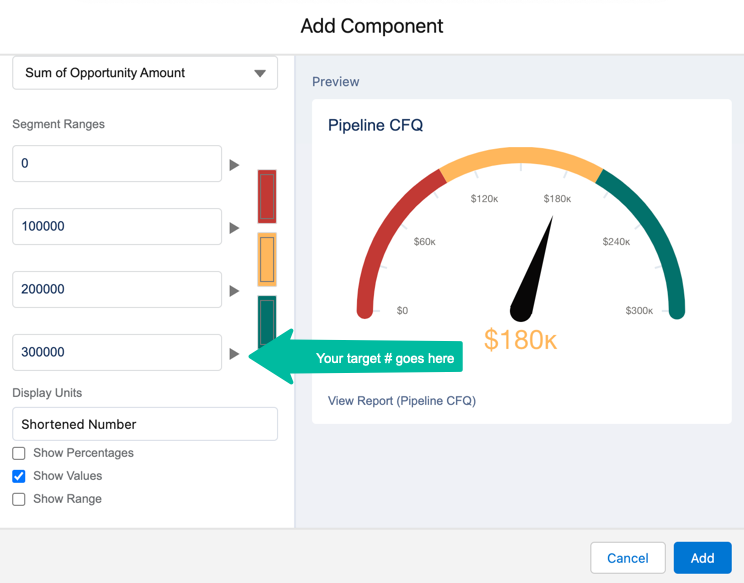
Dashboard component setup
- Chart type: Gauge

Closed won revenue
What this reports answers: How much marketing generated pipeline has been closed-won?
Report setup
- Report type: Campaigns with Influenced Opportunties
- Filters: Show me all opportunities CLOSED this fiscal quarter
- Grouped by: Close date
Dashboard component setup
- Chart type: Gauge
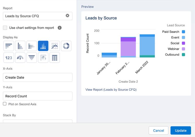
Leads created by source
What this reports answers: What are our top lead sources this quarter by month?
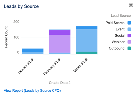
Report setup
- Report type: Leads
- Filters: Show me all leads created in the last fiscal quarter
- Grouped by: Create date and lead source
Dashboard component setup
- Chart type: Stacked vertical bar chart
- X-axis: Create date
- Y-axis: Record count
Contacts created by source
What this reports answers: What are our top contact sources this quarter by month?
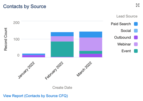
Report setup
- Report type: Contacts and Accounts
- Filters: Show me all accounts created in the last fiscal quarter
- Grouped by: Create date and lead source
Dashboard component setup
- Chart type: Stacked vertical bar chart
- X-axis: Create date
- Y-axis: Record count

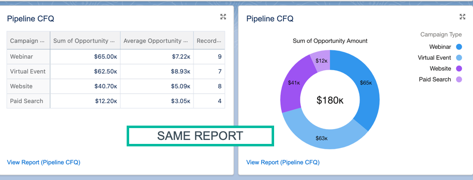
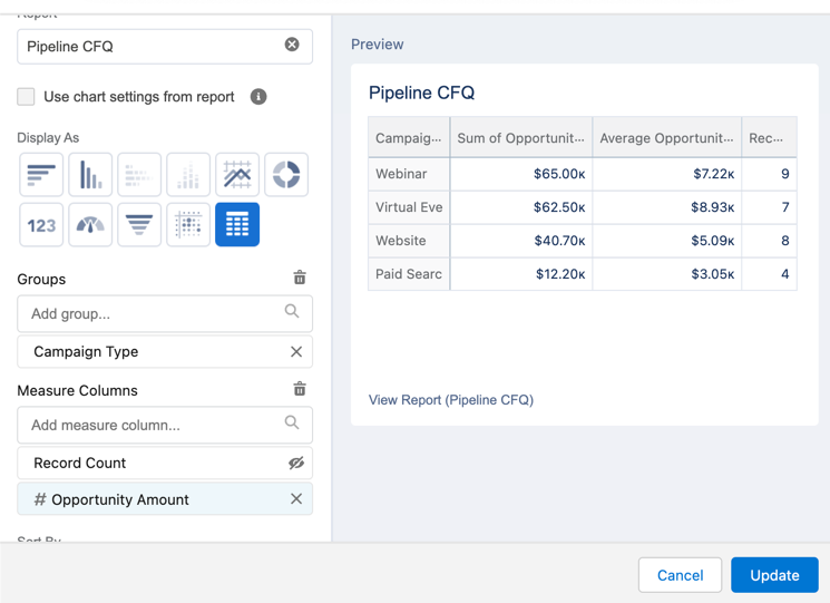
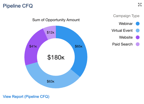
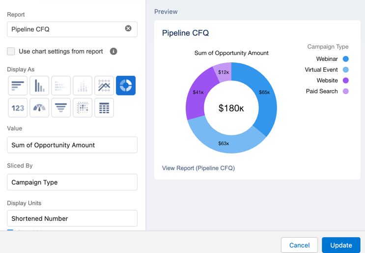
Pipeline by source
What this reports answers: What are the top marketing channels for generating pipeline?
Report setup
- Report type: Campaigns with influenced opportunities
- Filters: show me all campaigns where created date (opportunity) is this fiscal quarter
- Grouped by: Campaign type
- Columns: Opportunity amount summarized by sum and average
Dashboard component setup
Table component
- Chart type: Lightning table
- Grouped by: Campaign type
- Measure: Opportunity amount (summarize by sum and average amount)
Donut component
- Chart type: Donut
Marketing qualified leads (MQLs)
If you want to learn how to display MQL reports within your dashboard, check out this blog post.
Questions?
Send me a tweet @jennamolby, or contact the Sercante team for help.


